Devlog #2
WEEK 2
Focus
This week was spent nailing down core aspects we outlined in our design document, including paint splatting and player controls. Most of the work done this week was ground work for features to come (and so there is little to show for these things), such as a more robust host tracking system (an upgrade to the singleton system), and code refactoring for future enemy/host types (hosts can now have independent health decay rates for example).
Player Controls
An important aspect of the game that we wanted to make sure we got right was the player controls. The light enemy needed to be fast and agile. This was achieved using Unity's inbuilt physics and the rigidbody on each enemy to give the player a small acceleration and deceleration time.
The Virus (Host Swapping)
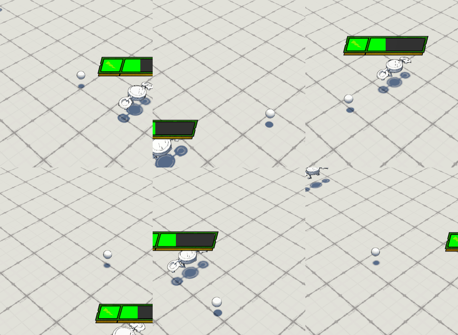
We decided to make the host swapping function by firing a special bullet that would temporarily become the player's host, until it collides with an enemy or the environment (the latter is a game over condition). It became obvious that it would be frustrating to have the bullet miss by a small margin and cause a game over, so we tested a homing bullet which can be seen below.

This can lead to situations where virus spins around the target infinitely as seen below (the numbers can be tweaked to fix this issue though).
Menu and UI
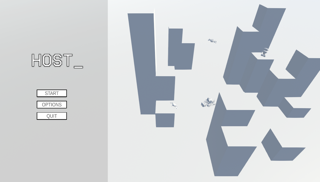
When designing the main menu, we wanted to keep the UI simple and minimalist. Adding a 3D background makes the menu more interesting while keeping that minimal look due to our cartoony art style.
Colouring
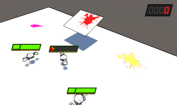
The style of the world is a major part of the game with the ability to colour the world. This is something that has been worked on all week and is finally at a point in development that it is working well enough to present. The core functionality of the shader came from this amazing video:
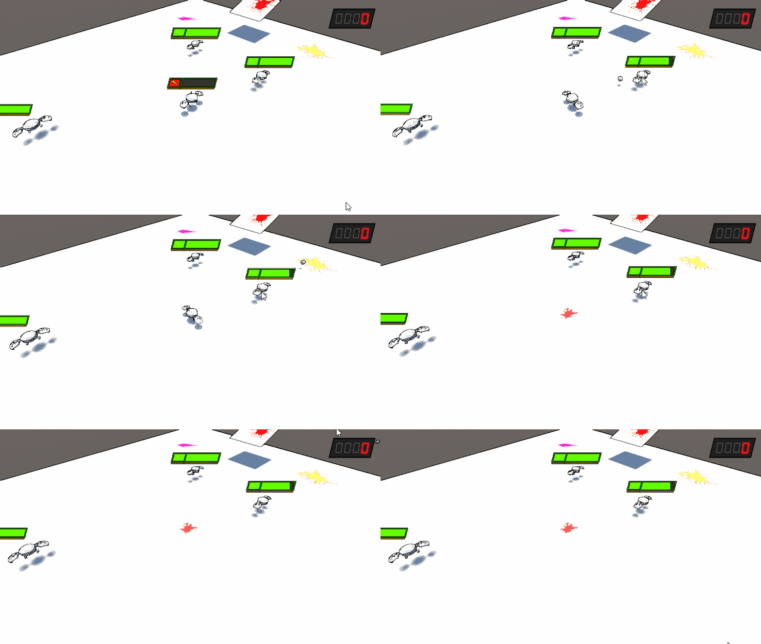
and modified to meet the needs of this project. Swapping from paint blobs (loose circles) to full paint splatters (images we can make) allows for much more control over the imagery of how the paint functions within the world. Rotation was also added into the shader so that paint can follow the path of momentum in high impact cases such as a robot exploding.
An example (that is a major WIP) of an enemy exploding.
Environment
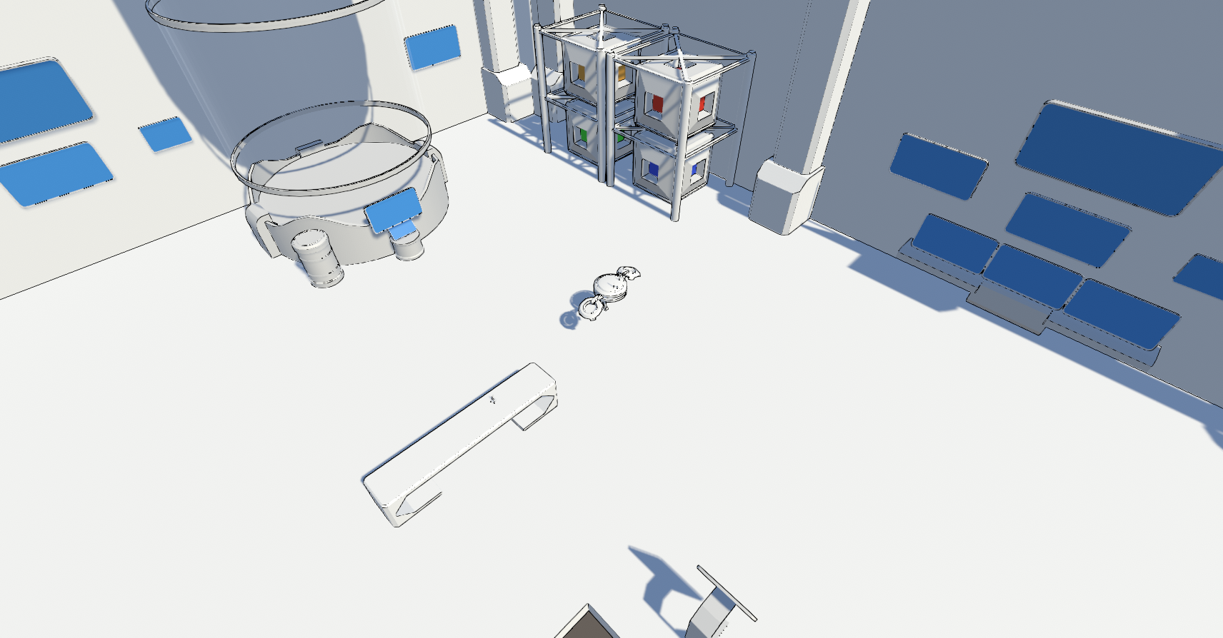
Since the lore (if you will) of the world is that its based within a high-tech facility sapping the colour out of the world, it was crucial that the environmental assets placed within the levels reflect this. Since we have an outline shader that is cast over all objects within the world, all assets need to be simple enough that they don't distract the player, but also not be bland, as more geometry creates thicker lines from the shader. Knowing this, it allowed us to create assets that were minimalistic, but had their details brought out by the shader.
The assets bellow include:
- Sleek sci-fi table
- Round container
- A Containment Unit (could store colour sapped from the world or old salvage)
- An array of screens
- Wall pillars (to details the walls)
- Storage racks
- Colour cubes (stores colour sapped from the world)
- A small flask (on the table(hard to see))
Files
KIT207 - HOST_
More posts
- Devlog #6 - FinalMay 31, 2024
- Devlog #5May 27, 2024
- Devlog #4May 19, 2024
- Devlog #3May 12, 2024
- Devlog #1Apr 28, 2024

Leave a comment
Log in with itch.io to leave a comment.